Project: Predicting Used Car Prices with Random Forests

This is for those who want to get into data science, who have a little bit of knowledge but are having a hard time coming up with your first data science project. That’s why I created a step by step guide to completing your first end-to-end machine learning model! Follow along, and you’ll learn a wide range of new skills.
I used Kaggle’s used car data set because it had a variety of categorical and numerical data and allows you to explore different ways of dealing with missing data. I divided out my project into three parts:
- Exploratory Data Analysis
- Data Modelling
- Feature Importance
1. Exploratory Data Analysis
Understanding my Data
# Importing Libraries and Data
import numpy as np
import pandas as pd # data processing, CSV file I/O (e.g. pd.read_csv)
import os
for dirname, _, filenames in os.walk('/kaggle/input'):
    for filename in filenames:
        print(os.path.join(dirname, filename))
df = pd.read_csv("../input/craigslist-carstrucks-data/vehicles.csv")# Get a quick glimpse of what I'm working with
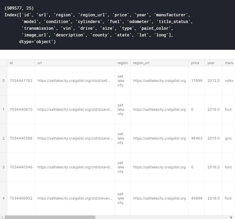
print(df.shape)
print(df.columns)
df.head()
The first thing that I always do when tackling a data science problem is getting an understanding of the dataset that I’m working with. Using df.shape, df.columns, and df.head(), I’m able to see what features I’m working with and what each feature entails.
Exploring Categorical Data
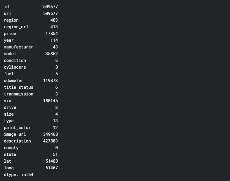
df.nunique(axis=0)
I like to use df.nunique(axis=0), to see how many unique values there are for each variable. Using this, I can see if there’s anything out of the blue and identify any potential issues. For example, if it showed that there were 60 states, that would raise a red flag because there are only 50 states.
Exploring Numerical Data
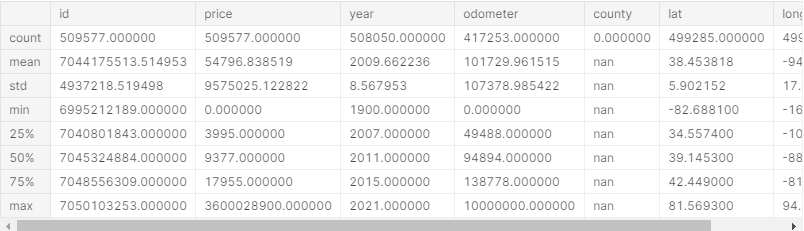
df.describe().apply(lambda s: s.apply(lambda x: format(x, 'f')))
For numerical data, I use df.describe() to get a quick overview of my data. For example, I can immediately see problems with price, as the minimum price is $0 and the maximum price is $3,600,028,900.
Later on, you’ll see how I deal with these unrealistic outliers.
Columns with too many Null Values
NA_val = df.isna().sum()
def na_filter(na, threshold = .4): #only select variables that passees the threshold
    col_pass = []
    for i in na.keys():
        if na[i]/df.shape[0]<threshold:
            col_pass.append(i)
    return col_pass
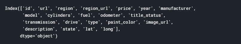
df_cleaned = df[na_filter(NA_val)]
df_cleaned.columns
Before continuing with the rest of my EDA, I used the code above to remove all columns where more than 40% of the values are null. This leaves me with the remaining columns below.
Removing Outliers
df_cleaned = df_cleaned[df_cleaned['price'].between(999.99, 250000)] # Computing IQR
Q1 = df_cleaned['price'].quantile(0.25)
Q3 = df_cleaned['price'].quantile(0.75)
IQR = Q3 - Q1
# Filtering Values between Q1-1.5IQR and Q3+1.5IQR
df_filtered = df_cleaned.query('(@Q1 - 1.5 * @IQR) <= price <= (@Q3 + 1.5 * @IQR)')
df_filtered.boxplot('price')
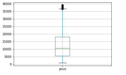
Before removing the outliers for price using the interquartile (IQR) method, I decided to set the range of price to more realistic numbers, so that the standard deviations would be calculated to a more realistic number than 9,575,025.
The IQR, also called the midspread, is a measure of statistical dispersion and can be used to get identify and remove outliers. The theory of the IQR range rule is as follows:
- Calculate IQR (= 3rd quartile — 1st quartile)
- Find the minimum number of the range (=1st quartile — 1.5 * IQR)
- Find the maximum number of the range (=3rd quartile + 1.5 * IQR)
- Remove any values that lie outside of this range.
You can see in the boxplot above that I significantly reduced the range of price using this method.
df_filtered.describe().apply(lambda s: s.apply(lambda x: format(x, 'f')))
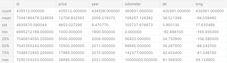
Using .describe() again, we can see that the range of price seems much more realistic than it initially was, but year and odometer seem a bit off (for example the max value for year is 2021).
I used the code below to set the ranges for year to 1900–2020 and odometer to 0–271341.5.
# cant be newer than 2020
df_filtered = df_filtered[df_filtered['year'].between(1900, 2020)]# = 140000 + 1.5 * (140000-52379)
df_filtered = df_filtered[df_filtered['odometer'].between(0, 271431.5)]
Dropping Remaining Columns
df_final = df_filtered.copy().drop(['id','url','region_url','image_url','region','description','model','state','paint_color'], axis=1
df_final.shape
By partially using my intuition and partially guessing and checking, I removed the following columns:
- url, id, region_url, image_url: they’re completely irrelevant to the analysis that’s being conducted
- description: description might be able to be used using natural language processing, but is beyond the scope of this project and was disregarded
- region, state: I got rid of these because they essentially communicate the same information as latitude and longitude.
- model: I got rid of this because there were too many distinct values to convert it to dummy variables. Additionally, I couldn’t use label encoding because the values are not ordered.
- paint_color: Lastly I got rid of this after conducting feature importance (which you’ll see later). Since feature importance indicated that paint_color had little importance in determining price, I removed it and the accuracy of the model improved.
Visualizing variables and relationships
import matplotlib.pylab as plt
import seaborn as sns
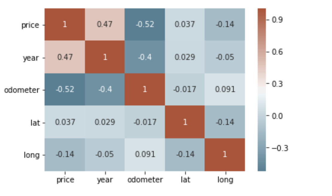
# calculate correlation matrix
corr = df_final.corr()# plot the heatmap
sns.heatmap(corr, xticklabels=corr.columns, yticklabels=corr.columns, annot=True, cmap=sns.diverging_palette(220, 20, as_cmap=True))
After cleaning the data, I wanted to visualize my data and better understand the relationships between different variables. Using sns.heatmap(), we can see that the year is positively correlated with price and odometer is negatively correlated with price — this makes sense! Looks like we’re on the right track.
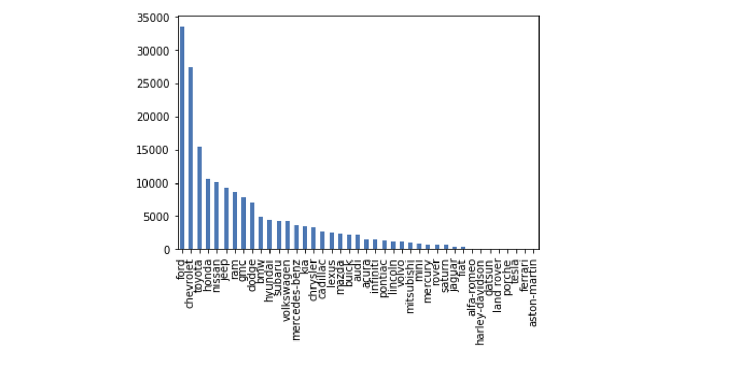
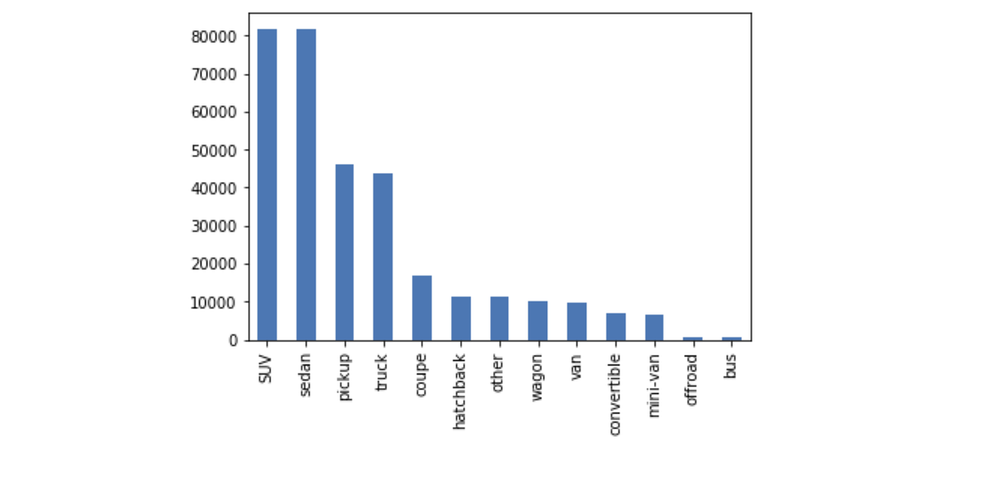
df_final['manufacturer'].value_counts().plot(kind='bar')df_cleaned['type'].value_counts().plot(kind='bar')
For my own interest, I plotted some categorical attributes using a bar graph (see below). There are many more visualizations that you can do to learn more about your dataset, like scatterplots and boxplots, but we’ll be moving on to the next part, data modelling!
Data Modelling
Dummy Variables
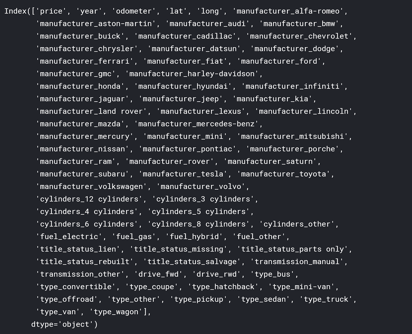
df_final = pd.get_dummies(df_final, drop_first=True)
print(df_final.columns)
To be able to use categorical data in my random forest model, I used pd.get_dummies(). This essentially turns every unique value of a variable into its own binary variable. For example, if one of the manufacturers is Honda, then a new dummy variable called ‘manufacturer_honda’ will be created — it will be equal to 1 if it is a Honda and 0 if not.
Scaling the data
from sklearn.preprocessing import StandardScaler
X_head = df_final.iloc[:, df_final.columns != 'price']
X = df_final.loc[:, df_final.columns != 'price']
y = df_final['price']
X = StandardScaler().fit_transform(X)
Next, I scaled the data using StandardScaler. Prasoon provides a good answer here why we scale (or normalize) our data, but essentially, this is done so that the scale of our independent variables does not affect the composition of our model. For example, the max number for year is 2020 and the max number for odometer is over 200,000. If we don’t scale the data, a small change in odometer will have a greater impact than the same change in year.
Creating the model
from sklearn.ensemble import RandomForestRegressor
from sklearn.model_selection import train_test_split
from sklearn.metrics import mean_absolute_error as mae
X_train, X_test, y_train, y_test = train_test_split(X, y, test_size=.25, random_state=0)
model = RandomForestRegressor(random_state=1)
model.fit(X_train, y_train)
pred = model.predict(X_test)
I decided to use the random forest algorithm for a number of reasons:
- It handles high-dimensionality very well since it takes subsets of data.
- It is extremely versatile and requires very little preprocessing
- It is great at avoiding overfitting since each decision tree has low bias
- It allows you to check for feature importance, which you’ll see in the next section!
Checking accuracy of the model
print(mae(y_test, pred))
print(df_final['price'].mean())model.score(X_test,y_test)
Overall, my model achieved an MAE of $1,590 given a mean price of around $12600 and has an accuracy of 90.5%!


Feature Importance
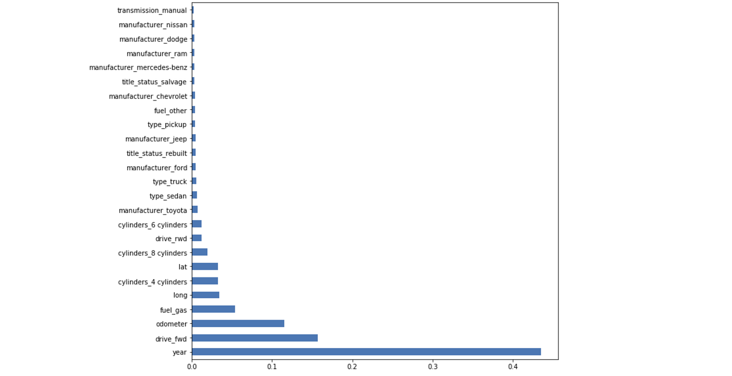
feat_importances = pd.Series(model.feature_importances_, index=X_head.columns)
feat_importances.nlargest(25).plot(kind='barh',figsize=(10,10))
I spent a lot of time finding the best definition of feature importance and Christoph Molnar provided the best definition (see here). He said:
‘We measure the importance of a feature by calculating the increase in the model’s prediction error after permuting the feature. A feature is “important” if shuffling its values increases the model error, because in this case the model relied on the feature for the prediction. A feature is “unimportant” if shuffling its values leaves the model error unchanged, because in this case the model ignored the feature for the prediction.’
Given this, we can see that the three most important features in determining price are year, drive (if it’s front-wheel drive), and odometer. Feature Importance is a great way to rationalize and explain your model to a non-technical person. It’s also great for feature selection if you need to reduce your dimensionality.
That’s it for my project! I hope this inspires people who want to get into data science to actually get started. Let me know what other interesting projects you’d like to see in the future in the comments :)
Comments
Post a Comment